home exhibitions photography est

Friday, 7 December 2012

Don McCullin meets Digital Photography

Yesterday circumstances were such that I didn't make it to college but I did manage to be creative of sorts. I started to look at photographs I had taken over the past year and to pull out suitable images for the Photography Unit at college. This turned into a positive experience as firstly I hadn't realised I had quite so many interesting images and secondly my head wasn't in full concentration mode. Why is this a good thing I hear you ask?.........well it meant that I could cope with playing but not with thinking too deeply.

So I played a little.......................and this


became this...............


and this.........................


became this.............


and finally this one.........


was transformed into this......


and this.....................


Today my head is in a different place so I probably would approach this task differently which is always the case anyway....different time different place. Having said that I like yesterdays results.

I also spent some time today watching this short film on the Canon website which documents Don McCullin's first journey into the world of digital photography. It's worth a visit if you have the time. I found it immensely comforting watching such an iconic photographer getting to grips with the latest technological gadgetry..... and he made it look so easy.


Monday, 3 December 2012

How to Kill Two Birds with One Stone


Tonight I was working on designs for the surface pattern unit at college. I wanted to explain how my design had developed from two dimensional to 3D so decided to use photographs. I photographed the object and then loaded the image onto the computer to crop it etc before printing and pasting into my sketchbook.

Suddenly a eureka moment........I could use this for my photography unit. You have no idea how happy this little light bulb moment made me feel. I played around with the image on Picassa and this was the result. I love the contrasts in the image. It looks like the logo for The Scottish Gallery!


My photography unit has been lagging behind, probably because it's the one I feel least confident about. I thought if I really concentrated on the other two units first I'd have just enough time to complete photography, hoping that the tight time schedule would fire up some inspiration. 

Little did I think I could kill two birds with one stone

As someone who likes contrasts, while I was doing two jobs at once on the computer a message popped up to say the temperature in New Zealand was approaching 25 degrees. Here the temperature was zero degrees. This produced another light bulb moment....but that's for another post. 


Tuesday, 27 November 2012

Kathe Kollwitz

Sorry there has not been much blogging lately but sometimes barriers pop up that you have little control over. A little time out was needed and I'm now back in the swing of things. I really admire this artists work.......it can be a bit depressive so I've chosen a portrait in profile without too much emotion to begin with.

Kathe Kollwitz (1867 - 1945) was a German artist best known for her printmaking and her vast range of tonal work. She was also a socialist who hoped her powerful and graphic art works would have an effect on how ordinary people viewed their world and hoped it would move people to action. I first came across her work last year when researching print makers for college and this year she is one of the artists I've chosen to look at for observational drawing.

Wilhelmine Mohr  Kathe Kollwitz
Charcoal

I chose this drawing because I liked the strong tonal values especially around the eye and also I wanted to work in charcoal.

The shape of the forehead is too sloped and the chin and lips are a bit prominent. I need to put more shading under the chin. The texture of the paper in my sketchbook is very smooth but the paper used in the original is quite textured. I preferred that effect so for the next drawing I switched to pastel paper.


The paper was grey so I continued with charcoal and also used white conte pastel to add highlights. The forehead is still a little short and the chin a bit prominent but I think it's becoming more like the original. It definitely helped using the pastel paper.

It's amazing how different the drawings look when they are loaded up on the blog. Mistakes and differences are much more obvious and it's a real benefit to learning.


Tuesday, 13 November 2012

The Clearing


This is the photograph taken near St Fillans in Perthshire

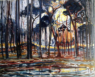
And these are the paintings by Piet Mondrian. The first one I saw at the Van Gogh to Kandinsky exhibition and loved the free style, the colour combinations and the symbolism involved.

Woods near Oele 1908


Wood with Beech Trees - Piet Mondrian
Wood with Beech Trees 1899


I'm really attracted to the tall vertical lines and the strong colours so with this in mind here is my finished (maybe!!) landscape


Unlike Mondrian's trees, my trees dissolve into the atmosphere for whatever reason you care to think of. I have my reasons and you will have yours.

I'm not entirely sure about the wall...I thought it was too dark but on reflection I think that it balances the painting. If I took it out or chopped the painting in half the composition would be similar to Mondrian's Wood with Beech Trees.

Think I'll call this one The Clearing......it suits the image, the symbolism and the reason for posting.


Monday, 12 November 2012

"I can't quite imagine what you're doing"

When my tutor said this last week I had a fleeting thought that this was perhaps not a good thing to hear. Not to worry, I reassured myself ... artists are allowed to be a bit vague. A traceable line of inquiry is all that is needed. If my inner voice is telling me to do this then that should be OK....it's my inner voice after all and that's what the unit is about.


Unfinished Landscape
Acrylic on Mount Board
16" x 23"

So in an attempt to get my act together with my "Inner Voice" and to reassure my tutor, I stopped researching (wasting my time) and got on with painting. This painting did not start life like this. It evolved as I worked. It's a reaction to my thought processes. It's bigger than the little studies I have done so far but I'd like it to be bigger still. It's painted in acrylics and I'd like it to be oils. I plan the finished pieces to be in oil.

My inspiration started with a photograph taken of a landscape near St Fillans in Perthshire and also the landscapes of the dutch painter Piet Mondrian. I plan to finish the painting tomorrow and post it along with the original photograph and images by Piet Mondrian. Of course it may have changed completely by the time it reaches my blog.


Day 3 Sketch a Day

Today I decided to sketch using the reed pens I made when I was researching Van Gogh's drawings. I used two pens, one thick and the other slightly thinner.


I read that if you soak the reed pens in water for a couple of hours then they hold more ink so I gave this a try and it seemed to work. I started with the poppy seeds and then moved on to a sunflower head which I lay on its side


The sunflower was really complicated with lots of dead petals leaves and seeds. The idea for these sketches is to work fairly quickly so I tried to get down enough information in less than 10 minutes. I'm pleased with the result.


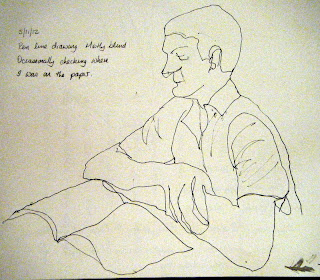
Time for a change of subject matter.....found this man reading in the conservatory.....just perfect for my next sketch. I concentrated on the head only this time. By now I was feeling more confident with the pens and I could judge the amount of ink they held which helped with the mark making. I was pleased with this sketch. I did think about adding more marks but felt that the composition worked well as it was.

I have to admit it's immensely satisfying working with tools that you have made yourself. The whole experience felt more organic, almost like the pen was an extension of my own fingers. Some may find having to renew the ink an interruption to the flow but you just have to look at the drawings of Van Gogh and wonder at the fluidity of his mark making.


Monday, 5 November 2012

Day 2 Sketch a Day

Managed another two sketches today. They only took about 5 - 10 minutes at the most. I continued with the line drawing in ink theme and allowed myself to check my position occasionally on the portrait. The other one was done in my garden using a dip pen and ink and finished with an ink wash.


It amazes me how without looking at the drawing I managed to get the perspective of the arms looking fairly accurate.


The difference with this drawing is that I looked more closely at the drawing rather than letting my hand follow my eyes around the images. Despite adding some tone I think the image is flat and less lively and less appealing than the others.


Sunday, 4 November 2012

A Sketch a Day


A sketch a day shouldn't be difficult to achieve but committing to post it on my blog somehow turns a simple task into something quite scary. Anyway here goes.........


Still Life  Blind Ink Drawing
Apple Orange and Poppy Seed Heads


Still Life 2 Blind Ink Drawing
Glass with Poppy Seed Heads

I love the naivety and fragility of these drawings. This technique gives me permission to loosen up and the drawings then become full of life which would not have happened if I had allowed my perfectionism to take over. It takes away the fear of making a mistake ....there are no wrong marks. Suddenly it's ok to use pen. I don't have to rub out. I am drawing every line as my eye follows it. My hand can only take instructions from my eyes and I draw exactly what I see.


Saturday, 3 November 2012

Picasso and Modern British Art


Last week we visited this exhibition at The Scottish Gallery of Modern Art and it has to be one of the best exhibitions I have ever attended. I was familiar with Picasso's work but my knowledge of the extent and versatility of his work was very limited. The exhibition examined the influence of his work on British artists but I had no idea what I was about to experience. Each room presented the ever changing forms styles and colours of Picasso's work alongside that of the British artists he influenced in one way or another.
I hadn't researched the exhibition before the visit so each room was a complete surprise. Highlights for me were the rooms containing the work of Ben Nicholson, Henry Moore and strangely Francis Bacon whose work has never really grabbed my attention before. Of course David Hockney has to be mentioned here too.

If I had to choose one Picasso which stood out for me it would have to be this one


Pablo Picasso  The Three Dancers  1925
Oil on Canvas  

Three different forms suggesting different dance forms, ballet, Jazz, Latin, yet linked together holding hands. Apparently an energetic play on a love triangle. The work is large 215.3 x 142.2 and the colours strong and vibrant.

It is really hard to choose one piece of work from the British artists as there were many highlights but I've chosen this work from Ben Nicholson

Ben Nicholson '1924 (painting - trout)

Ben Nicholson (painting - trout) 1924
Oil on Canvas

This painting was beautiful. Subtle overlapping pastel colours and shapes which shimmered on the canvas balanced by the stronger shapes and colours top left and right. I associated Ben Nicholson with white geometric shapes but his use of colour here was captivating....loved it.

There were many many more I could blog about (150 in the whole exhibition) but only two for today. They need to be savoured. Hope you like them.


Monday, 22 October 2012

Symbolism and Naturalism


Symbolism and naturalism..... in the realms of painting these two movements would appear to be poles apart so I was intrigued to see what I was going to find in this room. The majority of the artists in this section underwent a naturalist phase in their early careers whereas today they generally find themselves grouped with symbolism.


Calm before the Storm   Hans Thoma  1906
Oil on cardboard   86 x 70 cm

This painting almost shouted at me. I was drawn to the bright yellow foreground which was even more dazzling set against the dark green of the trees and the grey turbulent sky. The simple composition was in contrast to the fine detail of the blades of corn and the foliage of the trees. I could almost sense that oppressiveness in the atmosphere just before an impending storm. This was one of my favourite paintings full of atmosphere and anticipation.

I thought I would squeeze in one more painting from this room just to show a different approach

Edvard Munch Melting Snow
Melting Snow Elgersburg  Edvard Munch 1906
Oil on Canvas 71 x 91cm

Here Munch uses colours we would not normally associate with a winters scene. The cold white snow melts and fades away to reveal the beautiful soft muted colours of the landscape like a patchwork quilt. Soft warm and cosy ready to snuggle up in........another mood change. 

Saturday, 20 October 2012

Van Gogh to Kandinsky


 nnnnnnnnnnnnnnnnnnnnnnnnnnnnnnnnnnnnnnnnnnnnnnnnnnnnnnnnnnnnnnnnnnnnnnnnnnnnnnnnnnnnnnnnnnnnnnnnnnnnnnnnnnnnnnnnnnnnnnnnnnnnnnnnnnnnnnand it was the first ev


Last Saturday I took myself off to Edinburgh to this exhibition at the Scottish National Gallery and I'm so glad I did This was the first ever exhibition dedicated to Symbolist landscape painting covering works from 1880-1910 and included works by Van Gogh, Gauguin,  Munch, Mondrian, Whistler and Kandinsky as well as other artists from throughout Europe. I was really hopeful that the exhibition would dovetail in with the work I was doing for my extending specialist techniques unit at college.

The works were exhibited within six rooms which led the viewer on a journey through symbolism to abstraction which highlighted the influence of literature, poetry, music, theology and mythology.I thought I would chose a painting from each room to write about as a means of reflecting on the exhibition. 

  Room I  Arcadia Contested

Arcadia is taken from Greek mythology and implies a land of peace and plenty.At the end of the nineteenth century great changes had swept across European society.Some artists envisaged new Arcadias while others took a more gloomy approach to the aftermath of industrialisation. 

The Island of the Dead 1880 Arnold Bocklin
Oil on Canvas  111 x 115 cm  

In 1880 Bocklin was commissioned by Marie Berna to paint a canvas in commemoration of her late husband . The result was "The Island of the Dead" The image is of a tall figure dressed in white  and a coffin in a shallow boat. They are being rowed by an oarsman toward an island. The island is like a large rock and the boat is gliding softly into the centre which appears to have split open and is filled with tall dark poplar trees. The figures in the boat and the rocks either side are lit. The rest of the painting is dark apart from the surrounding sky which appears light against the dark trees. Apart from a few ripples in the water there is no movement in the scene. The ripples suggest the inevitability of death as the boat glides into the great chasm. The verticals of the trees are pointing upwards to another world perhaps.

The image has a certain serenity and a feeling of calmness which I think comes from the stillness and the symmetry in the painting. On the other hand the stillness also evokes a feeling of fear and unease contributed to by the stark tonal values.
I'm sure when Marie Berna looked at this painting she would be able to "dream herself into the world of dark shadows " as Bocklin wrote she would.

In 1909 the Russian composer inspired by Bocklin's painting composed Opus 29 The Island of the Dead http://www.youtube.com/watch?v=N10YZ2Sk3Kg

Tomorrow I hope to post about my selection from the next room Symbolism and Naturalism

Sunday, 14 October 2012


Since looking at Rob Mulholland's work with highly polished steel I've been wondering if  incorporating something similar in my work might help with my "inner voice" unit at college. I've managed to source light weight mirrored board which is flexible. This would give me the ability to distort images. First I decided to experiment with tin foil. Good old bacofoil...not very reflective but cheap as chips. I glued it onto some mount board and began to play.

Acrylic on tinfoiled board

With a forest in mind I started to paint with acrylics laying down the colours fairly quickly to produce a loose image. I then scraped off some of the paint to reveal the foil underneath. As I did this images of painted pub mirrors came to mind.....not the message I was looking for.

Acrylic glaze on foil

The colours dried dull and flat so I painted another forest landscape this time using oil paints which I used straight from the tubes.


I dragged the colours down the board which gave the feeling of the dark canopy of the leaves and branches at the top getting lighter as the tree trunks reached the ground.. The zingy yellow/orange suggests a clearing ahead or a way forward. This image could have so many meanings. I scraped into the paints again hoping it would work this time. In retrospect I don't think the painting needed the sgraffito. It had lots to say without it. I love these colours.


I had cut out several pieces of board so I carried on painting using up the acrylic paints on my palette. I stayed with the theme of trees but this time they were symbols representing people who had an effect on my life.

The Good The Bad and The Ugly


Suffocation

Titles for these came easily...because it's about something I know inside out. It's about me, my life as it always has been and always will be. Aspects of my life I can't change. Circumstances that have moulded me into the person I am today

Oh dear !!!.....think I'll ditch the mirror idea.


Tuesday, 9 October 2012

Spiritual Path


"The Herald" newspaper recently posted an image of the work of Scottish sculptor Rob Mulholland on their "Picture of the Day"page. I identified with it immediately..........this was portraying exactly what I was trying to describe to my college class about my experience of being within a landscape. 

Surrounded by nature, dynamic, a sense of peace, a spiritual experience.

I've been wondering how I could encapsulate all this within a painting and as I research more I find other paths emerging that excite me.....sculpture, installation, mixed media. As I write excitement bubbles away. Pointing the route perhaps ???

To view works by Rob Mulholland  www.robmulholland.co.uk 

Tuesday, 2 October 2012

Landscapes.....ARRGHHHHHH!!!!

Sometimes I feel ready to explode ......you know that feeling when you don't know which way to turn but time is running out and you need to make your mind up fast. This is always a bad sign and usually indicates that my preoccupation with perfectionism has taken over and needs to be booted out the window. "You need to get on with painting" and "just get on with it" echo in my head. I know I told you to give me a good kick up the backside if I procrastinated but hey this is hard !

Ok ...so I get down to work on continuing with exploring specialist techniques. I've studied the drawings of Van Gogh and I've now chosen to look at his paintings and in particular his landscapes.
First I looked at Starry Night and decided to produce a small area of the painting in oils on canvas paper. I mixed the colours on the paper and fully expected some areas of muddy brown. I was pleasantly surprised with the results as the colours retained their clarity. I think the trick is not to play around with them...just apply them and leave them be.


Then I set myself a real challenge. Wheatfield with Crows 1890 was the last painting that Van Gogh produced before committing suicide. It's full of movement, darkness, emotion, anxiety, symbolism...the list is endless...how did he manage all this in one painting?


Wheatfields with Crows 1890 Van Gogh
Oil on Canvas

In the next study I again chose a small area and worked in oils on mount board. This time I applied an under painting of turpsy ultramarine blue on the top and a similar mix of yellow ochre on the bottom. This covered the white and meant I didn't need to use quite as much oil paint on top. It dried really quickly as it seemed to sink into the board and I was able to get on with painting the rest as before. I preferred using the canvas paper...I liked the texture and the feel the brush had on the surface.


I then decided to change to acrylics and to paint a section from memory. I found the acrylic paint less manoeuvrable on the board because of it's faster drying time and this hindered the flow. I scratched off some of the paint which helped restore some movement.


This has been a useful exercise. I prefer a textured surface over smooth base to paint on.  I have preferred using oils over acrylics. They have a luxurious feel  and greater clarity of colour. The use of sgraffito in the acrylic study adds movement and I could make use of this in an oil study also. 

When all is said and done....I rather like the acrylic version. 

Friday, 28 September 2012

Mystery Sculptures


The mysterious paper tree


While researching on the internet I came across this site and was really intrigued by these sculptures and the mystery behind them. If you're a book lover especially of Ian Rankin novels then you'll identify with them

"It started with your name @byleaveswelive and became a tree.… … We know that a library is so much more than a building full of books… a book is so much more than pages full of words.… This is for you in support of libraries, books, words, ideas….. a gesture (poetic maybe?)"


http://thisiscentralstation.com/featured/mysterious-paper-sculptures/

Monday, 17 September 2012

Crossing Borders - one week later!

On entering Niall Campbell's studio this is the first image to greet you from the far end of the converted shed. The painting is entitled "Pain" and is 6ft by 4ft. The photograph in no way does justice to this painting.....you have to see it to appreciate not only the size, the colours and how the pigments have behaved on the canvas but also to get a sense of the depth of feeling the painting projects. I immediately identified with the image. We respond in different ways often as a result of events going on in our lives at the time. It made me think of the destruction that can take place in the brain as a result of dementia and the pain this brings to families. The painting has a "neural" feel ....like a network of paths made by nerves and synapses. The white area could represent a stimulus, the dark area a black hole. Yet there is a beauty to the image, particularly where the pigments have been allowed to mingle together to produce their own patterns which gives comfort to the viewer. I didn't feel sad. I felt a connection with the painting.

Thursday, 13 September 2012

More Images


On the periphery of the campus I found these gates and I thought that it would make an interesting image looking through. I also liked the colour and the texture of the rust which added interest. I had difficulty taking the photograph as the light was shining on the screen and I had to hope for the best that I had captured the image I was looking for. I played around with this quite a bit trying to get the idea of looking through some sort of window but nothing seemed to be working. I went back to the beginning and decided to crop one section of the image as I had done on the previous photo....... and here's the result.


I like this image and I think the composition works but I would like to see the gate sharper. The texture of the rust is visible but I think it could be better. I took the image back to colour and enhanced the colours which really highlights the rust and the texture on the gate.


 I think the tones are too close to show up well in b/w and if my intention is to show texture then the image benefits from colour. On the other hand the b/w version makes me think what the story behind the image is. The choices we make when altering images therefore depends on the intention

Friday, 7 September 2012

Location Photography

Collage started this week and I feel like we hit the floor running. It was straight into location photography. The task was to head outside for 45 minutes and return with six photographs
......PHOTOGRAPHS not snaps.
Shouldn't be too difficult you may think. Unfortunately Borders College campus and surrounding area is not known for it's magnificent architecture and outstanding beauty. In addition to this I felt sure that many of the students were much more technically experienced with state of the art photographic gadgetry on their I-phones. This was going to be a challenge. I set to the task with some doubts but determined not to fail...........after all it's only the start of the unit............get a grip!!

Ok job done. Must be one or two "photographs" here. Now it was time to play with these images and digitally transform them into something even more interesting. Photographs Apple Macs and Photoshop were all too much in one day, so I returned home to the familiarity and comfort of my laptop and Picassa

This was the first image to be digitally enhanced. I thought that this iron fence looked like arms with pronged fingers reaching upwards to the sky...or a bit triffid like.


and after cropping straightening sharpening edges changing to b/w and Holga-ish this was the result.


Not triffids any more but certainly dark and threatening. I wondered what I could do with another section of the same photograph as some of the shapes in the bottom left hand corner were interesting and had potential.


Wow!!!! I'm really beginning to enjoy this now. I used the same effects as in the previous exercise and introduced another step - something called HRD-ish which "emulates high dynamic range look"! This added real depth to the image by adding the light tones making the shapes behind the fence recede. I like this image. I feel like I am looking through a fence at the shapes in the distance. The fence says KEEP OUT. The imagery is suggestive of something military, like a firing range and I feel cold, fear, suspense. They are like robots programmed to destroy- cold metal devoid of feeling.

This is a PHOTOGRAPH 


This exercise has taught me to really look at my surroundings with different eyes and that we are surrounded by imagery that has endless possibilities. There are images within images and images within our minds. We just need to keep our minds and eyes open.........think I need to stop before this gets too philosophical. More digital play-time tomorrow.


Wednesday, 22 August 2012

I've now started to paint the Irishman I mentioned in an earlier post. I'm using oils and have applied some light and mid tone and now working some darker tones. I have been working from a book called "Colour Mixing Recipes For Portraits" by William F. Powel and finding that I spend more time colour mixing than painting. To be honest it's a bit like painting by numbers and building up the image with glazes.

Still lots to do and will post more as it progresses.